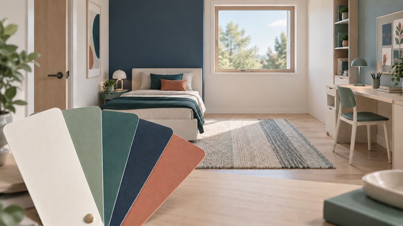
Choose a child's room palette by looking at the room together: what already belongs there, which colors the child enjoys, and how samples look in the light used every day. Feng shui color symbolism can offer a theme for that conversation. The decision should leave the child with a room they can use and recognize as their own.
Use traditional associations as a design language
The International Feng Shui Guild describes five elements used in feng shui: wood, fire, earth, metal and water. Its teaching associates these with colors as well as forms and materials. The table summarizes a few of those color associations; the decorating examples are optional ideas for exploring them.
| Element | Colors in the Guild's account | A small decorating experiment |
|---|---|---|
| Wood | Green; blue-green variations also appear. | Try a green fabric sample beside existing bedding. |
| Fire | Red. | Use a favorite red in artwork or a removable accent. |
| Earth | Yellow, tan and earth tones. | Compare a warm neutral with the floor and furniture. |
| Metal | White and gray. | Try a light background for the child's own artwork. |
| Water | Black and navy. | Test a dark accent on a small, easily changed item. |
These are symbolic categories, not a test of a child's personality or a prescription for behavior, learning or sleep. A child's stated preferences and observed comfort are more useful inputs to this decorating exercise than assigning them an “elemental type.” A color can represent an element without bringing literal water, fire or other objects into the room.
Build a palette together before buying anything
- List what stays. Include the floor, furniture, curtains, bedding and a favorite picture. A palette must work with these large existing areas.
- Ask for two or three favorites. Use fabric, crayons, pictures or sample cards. Ask “Where would you like to see this?” as well as “Do you like it?” A favorite bright color may be enjoyable in a small accent.
- Choose roles. Pick a background for the largest surfaces, a supporting color and an accent. These roles organize choices; they do not require fixed percentages or equal amounts of all five elements.
- Make two combinations. Put the samples beside the same existing furnishings. Give the child a genuine choice between feasible alternatives.
- Agree on the first change. Reuse an item, rotate artwork or try a textile before committing to a whole-room repaint. Set the budget and any practical limits openly.
Let a child describe a color in their own words. One person may call a blue peaceful, another cold, and another the color of a favorite team. Treat the description as their preference, without turning it into a universal psychological rule.
Three starting palettes to adapt
These invented examples are design suggestions, with no promised effect on mood or behavior. Screen colors are approximate: choose physical samples for a real room.
Ivory, sage and deep teal
Try ivory as a background, sage in a textile and teal as a small accent. Begin by comparing the greens with any warm wood already in the room.
Sample colors: ivory, pale sage, deep teal.
Warm white, clay and navy
Try warm white around existing furniture, clay in artwork and navy in bedding or a storage label. Check whether the navy still looks appealing under the evening lamp.
Sample colors: warm white, soft clay, navy.
Pale gray, golden yellow and blue
Try a pale-gray background and let the child choose between yellow and blue for the more prominent accent. Test these beside the actual floor before buying.
Sample colors: pale gray, golden yellow, muted blue.
Keep strong preferences visible even when the walls stay neutral. A child's drawing can contribute several colors and a personal connection without requiring a matching purchase.
Test samples in the room's ordinary light
Place physical samples near the surface where the color will be used. Look in daylight and with the usual evening lamps. Compare them beside furniture and bedding, not only against a blank sheet. For paint, follow the product's sampling, preparation and ventilation instructions, and keep painting materials out of children's reach.
Record three things for each combination: what the child likes, how it relates to the fixed furnishings, and what changes between daytime and evening. If a sample appears too strong across a large area, try it in a smaller role. If the child dislikes both options, revise the combinations before purchasing.
Keep a decorating change compatible with safe use
When color decisions lead to new storage or rearranged furniture, follow the CPSC's furniture-anchoring guidance and the furniture and anchor manufacturers' instructions. A low-looking piece can still need anchoring.
Choose cordless window coverings as advised by CPSC, and keep beds, furniture and toys away from windows and window-covering cords. Preserve usable exits and keep the room's practical requirements ahead of a decorative theme.
Use the room-review worksheet to save your samples' names, the child's choices and what you noticed in different light. Return to those observations when deciding whether another change is worth making.