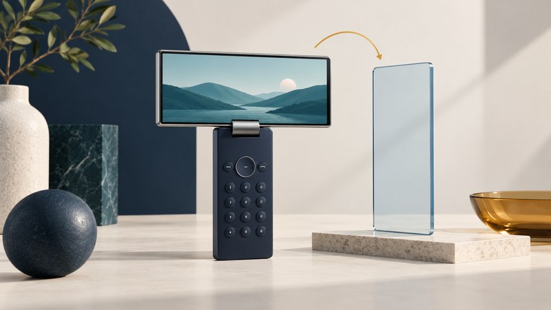
Samsung's SCH-V600 addressed a practical problem: pictures and video often suit a wide screen, while a phone's keypad suits a tall body. Its display could physically pivot into landscape orientation while the keys stayed upright. That small mechanical idea makes this early handset useful for understanding the relationship between a screen, its content, and its controls.
The screen moved independently of the keypad
Samsung's Korean announcement for the SCH-V600 and SPH-V6000 calls them the second generation of its horizontally rotating screen concept. It describes a smaller body and games intended for different orientations. This matters because turning the display was only one part of the experience: the software still needed a layout appropriate to that orientation.
Software auto-rotation changes how an interface is drawn after the whole device turns. A pivot mechanism changes the panel's physical position relative to the rest of the device. Neither operation creates additional pixels or makes an unsupported video format playable. Separate those questions when interpreting a specification.
Orientation changes how much of the screen a picture can use
The preceding SCH-V500 was documented in Samsung's August 30, 2004 release with a 2.2-inch, 320 × 240 QVGA display and a pivot for horizontal viewing. Those dimensions provide a convenient geometry example; they are not being used here as an independently verified V600 specification.
| Choice | What happens | What to inspect |
|---|---|---|
| Fit the whole picture | Preserves its proportions and edges; may leave empty bars. | Whether small details remain readable. |
| Fill by cropping | Preserves proportions but removes content at some edges. | Whether a face, caption, or important object disappears. |
| Stretch | Fills the area by changing proportions. | Whether circles become ovals or faces look distorted. |
A landscape screen does not mean every video fills it. A 16:9 clip fitted into a 4:3 viewport still leaves bars; a portrait photograph may fit better with the screen upright. The relevant comparison is the content's aspect ratio against the usable viewport, including any area occupied by controls.
Read the mechanism as a design tradeoff
Keeping the keypad upright can make its labels easier to read while watching a landscape picture. At the same time, the wider upper assembly changes the device's outline and the space needed around it. These are design consequences to examine, not evidence that one form was universally more comfortable or durable.
For a surviving example, inspect the intended motion in its model-specific instructions before moving it. Record how the panel sits in each position, whether the image changes orientation, and how a supported local photo or game uses the screen. Avoid forcing a stiff hinge. A video of smooth movement documents that specimen at that moment; it does not establish the lifetime of every hinge in the series.
Keep screen orientation, media decoding, and network delivery in separate columns. If a stored picture displays correctly but an old video service cannot be reached, the pivot test has still answered a useful question. Likewise, a file arriving on the phone does not establish that its player supports the codec inside it.
Place the V600 after the V500 without trusting a conflicting date
Samsung's surviving V600 archive page displays a 2001 date even though its text refers to the predecessor's 2004 award and the previous year's launch. That displayed date cannot describe the chronology stated in the article. The V500's dated 2004 release and the contemporary V600 announcement reproduced by Phys.org on April 3, 2005 place the design in the 2004–2005 sequence. The latter publication date is not a precise retail on-sale date.
The lasting idea is straightforward: hardware can arrange the screen and the controls for different jobs. Evaluating that idea means checking the movement, the interface, and the image framing together.