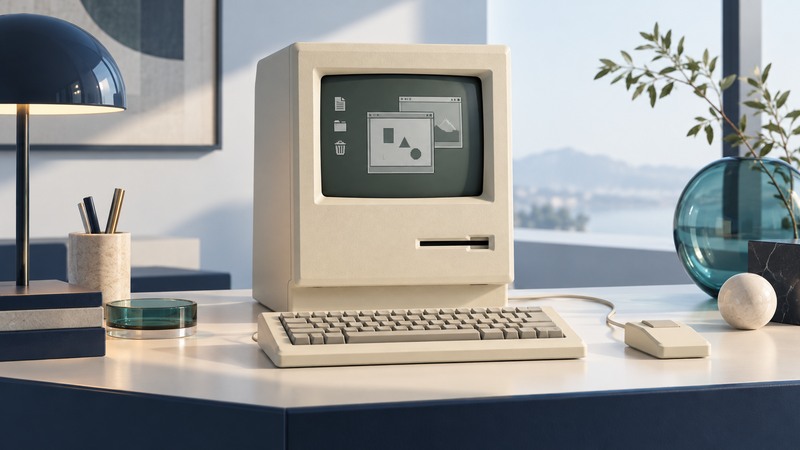
The original Macintosh made a graphical desktop, a mouse and visually oriented applications part of one compact personal-computer experience. Its importance becomes clearer when you examine an ordinary task—drawing something, placing it in a document and saving the result—alongside the machine’s tight memory and storage limits.
The machine introduced in January 1984
Apple identifies January 24, 1984 as the Macintosh 128K’s introduction date. For its original hardware, the specification appendix in the 1984 Macintosh owner’s guide, preserved as a scan is a useful primary reference. It describes the following configuration.
On narrow screens, focus the table and use the arrow keys or swipe to see every column.
| Feature | Documented specification | What it meant for use |
|---|---|---|
| Processor | Motorola MC68000, 7.8336 MHz | A processor supporting the graphical software within a compact system. |
| Working memory | 128 KB RAM | Programs, working data and graphics shared a small memory budget. |
| Built-in software storage | 64 KB ROM | Common system routines were available in the machine. |
| Display | 9-inch diagonal, 512 × 342 pixels | A fixed bitmap workspace for text, icons and drawings. |
| Disk storage | 400 KB formatted 3½-inch floppy | Software and documents traveled on small removable disks. |
The 128K identifies the original memory capacity. Later Macintosh models and upgrades changed what software and workloads were practical, so descriptions of a modified machine need its actual configuration. Treat a surviving unit’s disks, software version and hardware history as part of its identity.
A consistent way to work with visible objects
The owner’s guide teaches pointing, selecting, opening windows and choosing menu commands as everyday actions. Finder icons represent documents, applications and disks; the Clipboard carries information between operations. This vocabulary lets a learner reuse familiar actions across tasks instead of starting over with every application.
The important design question is what the user can see and manipulate. A document icon gives a visible object to select. A menu presents available commands. A changing selection or window provides feedback about the current target. These choices make an interaction understandable, but they also require learning: the difference between selecting an icon and opening it still matters.
For a modern reader studying the interface, follow one object through a task. Identify which window is active, what is selected, which command changes it and where the result is stored. That exercise reveals the interaction model more clearly than treating every familiar desktop feature as inevitable.
MacPaint, MacWrite and a small publishing task
The Computer History Museum’s release of MacPaint and QuickDraw source code preserves two central pieces of this experience with Apple’s permission. Bill Atkinson wrote MacPaint and the underlying QuickDraw graphics library. The museum explains how the application handles user actions while the graphics library supplies drawing operations.
MacWrite made formatted text a central demonstration of the machine. Apple’s 1984 Macintosh selling guide presents MacWrite and MacPaint together and contrasts the original 128K model with the later 512K machine’s ability to handle larger work. It is a period marketing document, useful for understanding the intended workflow when read alongside the actual manuals.
Illustrative task: imagine making a one-page club notice. Draw a small emblem in MacPaint, select and copy it, then bring it into a MacWrite document with the meeting text. Review the relationship between the image and text, save the document, and check the printed output using an appropriate printer. The value lies in carrying a visible object from drawing to composition; the complete task still depends on the application versions, available memory, disks and printer.
This example is a way to interpret the design, not a claim that every later desktop-publishing feature existed at launch. Compare the specific operation demonstrated with the software version that performed it.
The constraints were part of the experience
The owner’s guide describes alternating source and destination disks when copying with one drive. Disk handling was therefore part of ordinary file work. A small memory budget also made document size and application choice consequential. Those constraints explain why an interface demonstration and a sustained working session could leave different impressions.
A useful historical comparison asks both what became easier and what still interrupted the task. Visible editing could simplify arranging a notice; saving, disk swapping and managing available space remained work. Evaluate the whole sequence instead of using clock frequency or a single screenshot as a complete measure of usability.
Place the Macintosh in a longer history
Graphical interfaces and mouse-driven work had predecessors. In its Lisa source-code preservation announcement, the Computer History Museum dates Apple Lisa to January 19, 1983 and describes influences from Xerox PARC’s Smalltalk system, alongside Lisa’s own innovations. The Macintosh belongs in that developing history of interactive computing.
Its lasting contribution is best understood as a particular combination: compact hardware, coordinated software and an approachable set of visible actions. Study the preserved manuals, source code and demonstrations together. They let you separate what a machine actually did from promotional predictions and from features added by later generations.
For related hardware context, explore how later memory generations are identified and legacy display setup. Each guide keeps the specifications attached to its own era and equipment.