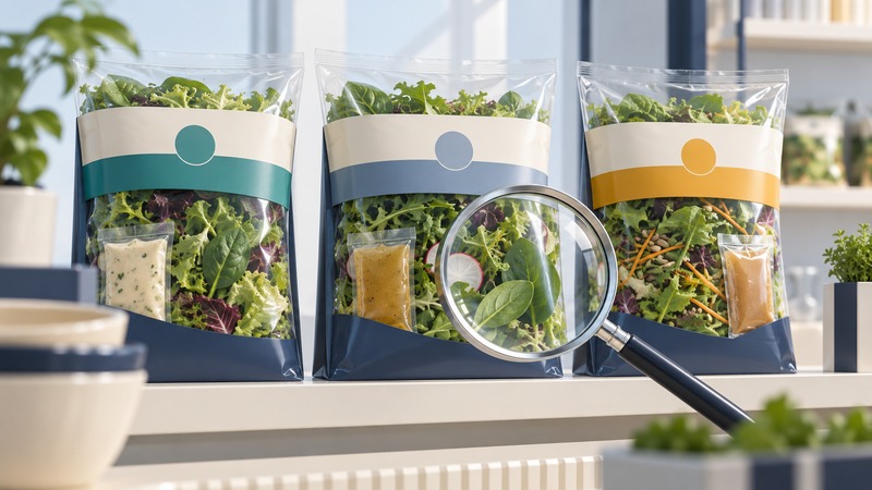
Dole's late-2017 salad packaging redesign offers a useful case for studying a basic design problem: helping a shopper identify the product, distinguish nearby alternatives, and find the information needed to choose. Its lasting lesson is about organizing information at the point of decision.
This is a historical design case and a practical evaluation method. The 2017 graphics are not a description of every Dole product sold today. For a current purchase, use the actual package and the manufacturer's current product information.
What the historical evidence establishes
Dole's 2020 sustainability report, pages 30–31, says that salad graphics launched in late 2017 were designed to make nutritional and ingredient information easier to review in stores. This is the company's account of the design objective, rather than an independent experiment measuring shopper comprehension or sales.
The useful question for a designer is how to evaluate that objective. Put a package beside the alternatives a shopper is likely to consider. Ask whether the product name, type, contents, and relevant details can be found in a sensible sequence. Attractive graphics and useful information should support the same decision.
Review three layers of information
On a small screen, scroll the table sideways to read all columns.
| Layer | Shopper's question | Review task |
|---|---|---|
| Product identity | What is this? | Find the product name and distinguish a plain blend from a kit or another format. |
| Comparison cues | Which version fits what I want? | Compare names, category labels, included components, and visual cues across the range. |
| Decision details | What exactly am I buying? | Locate ingredients, relevant allergen information, nutrition, quantity, and handling instructions on the actual package. |
Color can help organize a range, but pair it with explicit wording. A shopper should be able to distinguish products when a color is difficult to perceive, a shelf label partly covers the bag, or a small online thumbnail reduces the image. Test the naming system across several products together; a design that works alone may become ambiguous in a crowded shelf display.
Photography and transparent areas answer different questions. A prepared-food photograph can suggest a serving idea, while a window shows some of the contents. Review whether added ingredients in a pictured meal could be mistaken for items included in the pack. State the distinction clearly where it affects the choice.
Keep nutrition comparisons on the same basis
The FDA's explanation of the Nutrition Facts label emphasizes serving size and servings per container. Nutrition information is generally given per serving, and a package may contain multiple servings. A listed serving size describes the amount typically consumed; it is not an individualized eating recommendation.
For anyone designing commercial food labels, this review is a usability exercise. Regulatory labeling and claim review need the current requirements for the actual food, market, ingredients, and package. The FDA food labeling and nutrition resources are a starting point for U.S. requirements.
Test comprehension with specific tasks
Give representative shoppers the package or an accurate prototype at its expected size. Ask them to choose a specified type, find an ingredient, identify what is included, and explain the serving basis. Observe where they look, what they confuse, and what information they cannot locate. Avoid leading questions such as “Isn't this new label clearer?”
Compare versions using the same tasks and viewing conditions, and change their presentation order to reduce a simple order effect. Record task completion and the reasons for errors. A small qualitative review can reveal usability problems; population-level or sales claims require an appropriately designed study and adequate evidence.
After revising the layout, repeat the troublesome tasks with fresh participants where practical. Verify the physical proof, including folds, seams, reflective film, and any areas that become obscured when the bag is filled. Also review the online product image because small previews can hide distinctions visible in the store.
Turn observations into design decisions
Use a simple record: task, observed difficulty, proposed change, responsible reviewer, and retest result. For example, confusion between a kit and a plain blend suggests revisiting the product descriptor and included-components cue. Difficulty finding the nutrition panel suggests reviewing its location and the package's physical handling.
This approach makes the historical Dole objective actionable without assuming that the redesign achieved a particular sales increase. For the same problem across countries and languages, see global brand campaign planning; for choosing evidence sources, use the advertising reference guide.