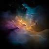
Genesis of Diffusion 1 - Image Index | How AI Transforms Text into Visual Imagery | Yenra Chromatic Genesis: The image, titled 'Genesis of Diffusion,' presents a vibrant and fluid visual composition that resembles abstract paint or colorful smoke billowing outwards from a central point. There are no clearly defined discernible objects; instead, a kaleidoscope of colors blend and swirl together, creating a sense of movement and dynamic energy. The colors aren't simply layered; they merge, creating gradients and secondary hues that contribute to the image's complexity. A deep, almost black, area occupies the lower left corner, grounding the more vibrant elements. This dark region gradually transitions into rich oranges, reds, and yellows, which then flow into cooler tones of turquoise, blues, and ultimately, pale violet and pinks towards the upper right. The texture is smooth and ethereal, resembling a soft, hazy cloud or a watercolor wash. The edges are blurry, contributing to the overall feeling of fluidity and diffusion. Light isn’t a key attribute, but the colors are so saturated that they appear to glow from within, creating a luminescent quality. The image evokes a sense of expansion and growth, like an explosion of color or the unfurling of a delicate bloom. The composition is entirely abstract; there's no horizon line, no focal point in a traditional sense. The entire canvas is filled with the swirling, colorful mass. There's a distinct sense of depth created by the varying shades and the blending of colors. It's as if one is looking into a swirling nebula or a cosmic cloud. The image doesn't depict a specific setting or location; it's a purely internal landscape, a representation of energy and emotion. The artist has skillfully used color to create a visually arresting and emotionally evocative work of art. The lack of defined forms encourages the viewer to interpret the image in their own way, fostering a subjective experience. Furthermore, the way the colors blend and interact suggests a delicate balance and harmony. The darker shades anchor the composition, while the lighter hues create a sense of lightness and airiness. The image feels both powerful and fragile, a testament to the artist's ability to convey complex emotions through abstract forms. It's a captivating visual experience that invites contemplation and encourages the viewer to explore the depths of their own imagination.