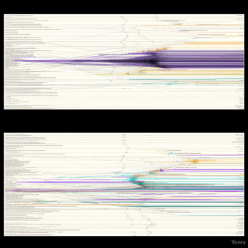
Politeness Pays Off 1 - Image Index | Yenra Multicolored Chart: A chart with multiple horizontal and vertical lines of varying colors, including purple, blue, green, yellow, and orange. The chart is divided into two sections, each with a distinct color scheme. In the top section, most lines are colored purple, with some blue and yellow lines scattered throughout. The bottom section features predominantly blue and green lines, with a few yellow and orange lines present. The background of the chart is white, providing a clean contrast to the vibrant colors of the lines. Overall, the chart appears to be displaying data in a complex and layered manner, using color to differentiate between various categories or trends.