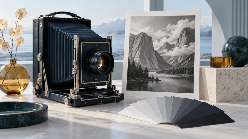
Ansel Adams’s photographs reward looking beyond the subject to the decisions that make it readable: where light falls, which tones separate, what the frame includes, and how the finished print directs attention. Start with a verified work and its collection record, then practice a small exercise with a photograph of your own.
Start with two different kinds of picture
Open the National Archives record for The Tetons – Snake River, 1942. The record connects the photograph with Adams’s National Park Service mural commission and identifies the archival object. Look at the full image before zooming in. Trace where your eye enters, which light and dark areas hold it, and how the river relates the foreground to the mountains.
Then study Rose and Driftwood, 1932, through The Ansel Adams Gallery’s account. Its close subject offers a different scale of attention from the distant landscape. Compare the role of texture, the separation between the flower and its support, and how much space surrounds the subject. The gallery describes a deliberately arranged still life, which helps place the image’s construction in context.
Make two columns of notes: visible observations and documented context. “The pale subject separates from the darker background” is an observation you can test against the image. A date, location, or account of its making comes from the record. Keeping those sources distinct makes your interpretation more precise.
Understand visualization as a practical intention
Visualization connects the scene in front of the camera with an imagined finished picture. It gives exposure, framing, and printing choices a purpose. The Center for Creative Photography’s Intimate Nature guide explains Adams’s close-view work, view-camera practice, and the relationship between intended tones and the print.
For your own work, describe the intention before editing: perhaps a pale object should feel luminous while the surrounding texture stays quiet. That sentence is more actionable than “make it dramatic.” You can ask whether a change in exposure, framing, or local contrast advances that intention.
A useful intention leaves room for discovery. If the light or expression changes, reconsider the picture. The point is to connect choices with an outcome you can evaluate, not to force every scene into a predetermined look.
Keep the Zone System in its photographic context
Adams and Fred Archer developed the Zone System around 1939–1940. As the Center for Creative Photography explains, it coordinates exposure and development to control black-and-white film tones, especially when individual sheets can be processed separately. The final print remains part of the process.
Digital photography offers different capture and processing controls. The transferable habit is to decide which tones matter and check how they survive the entire route to the finished image. A digital histogram, raw-processing slider, or grayscale conversion should be understood through its own behavior rather than treated as a direct substitute for a film-development instruction.
Ask three questions: Which bright area must retain texture? Which dark area needs separation? Where should the viewer’s attention settle? Those questions guide a bounded experiment without requiring a full film-testing system.
Try a three-tone exercise with your own photograph
- Choose a static scene with a light object, a middle-toned area, and a dark background. Use objects you can photograph comfortably in steady light.
- Write one sentence describing how you want those areas to relate in the finished image.
- Capture a file with usable detail in the important areas. Check the camera’s histogram and highlight warning, then inspect the image itself.
- Make a neutral monochrome version and a second version adjusted toward your intention. Keep the original and both edits.
- Compare at the same viewing size. Inspect for clipped texture, halos along boundaries, and shadows that have lost useful separation.
- If the picture is intended for paper, make a small test print and judge it in consistent light. Record one change for a second attempt.
Use collection records to go deeper
The Center for Creative Photography’s Adams page provides an authoritative route into his career and archive. When comparing reproductions, record the institution, title, negative date, and print date where supplied. Different prints, scans, and screens can change the tonal appearance; compare like with like before attributing a difference to the artist.
Use the institution’s rights and access information if you want to reproduce a work. For learning, a direct link to a verified record and careful notes can be more useful than an unlabeled image copied into a folder. Return to your own photograph after the study and identify one decision you can test.