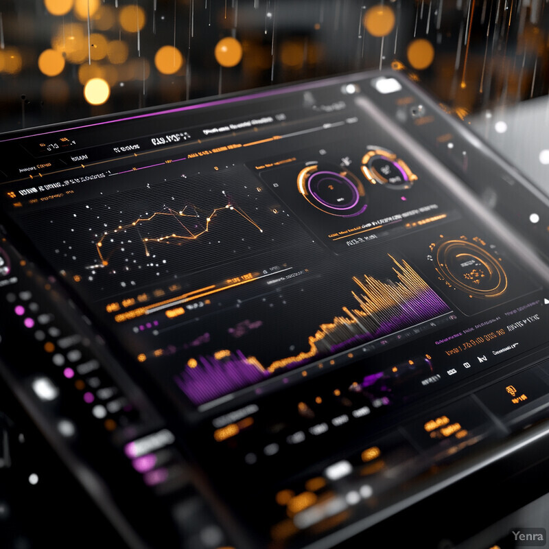
Adaptive Thresholding for Alerts 3 - Image Index | 20 Ways AI is Advancing Early Warning Systems for Natural Disasters High-Tech Data Visualization: A futuristic-looking screen displaying various graphs and charts, with a predominantly black background and accents of purple and orange. The screen is angled slightly to the right, suggesting it may be part of an interactive system or dashboard. The graphs appear to be dynamic, with changing lines and bars that could indicate real-time data updates. Some areas are blurry, possibly due to motion blur or the use of a shallow depth of field effect. Notable colors include black, purple, and orange, which dominate the visual palette. The overall impression is one of high-tech sophistication, suggesting this image might be used in advertising for software or technology companies.