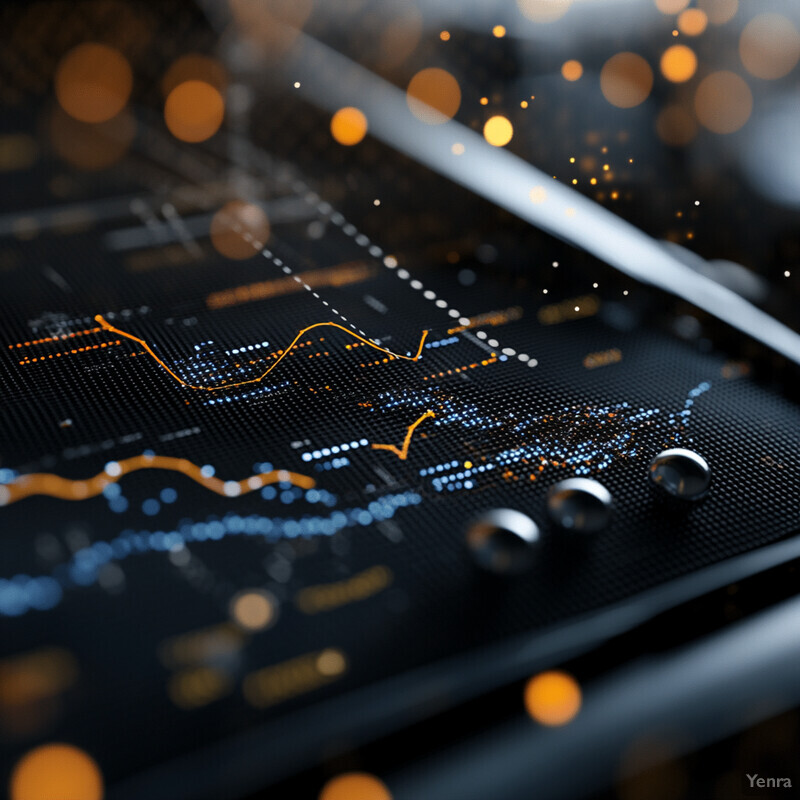
Catalyst Performance Prediction 2 - Image Index | 20 Ways AI is Advancing Chemical Analysis in Oil and Gas Performance Metrics Over Time: A sophisticated visual representation of data analysis, comprising various graphs and charts on a black background. The dominant colors are orange and blue, which are used to highlight key trends or patterns in the data. At first glance, it appears that the graph is displaying some kind of performance metrics over time, with the x-axis representing dates or timestamps and the y-axis indicating values such as speed, temperature, or another relevant metric. The lines on the graph seem to be fluctuating within a certain range, suggesting that the system being monitored is experiencing variations in its performance throughout the observed period. It's possible that these fluctuations are due to external factors or internal system changes. Overall, the image effectively conveys complex data insights through a clear and visually appealing format.